Responsive Web Design
November 25, 2018
Responsive web design encompasses all of the techniques and practices used to ensure that a website adapts to the many different devices and screen sizes that might access it. This website, for example, will change how it is displayed depending on the size of the browser’s viewport, so that it is optimized for both mobile and desktop use. The days of making a webpage for a fixed screen size are over, now that web traffic is evenly split between mobile and desktop browsers.
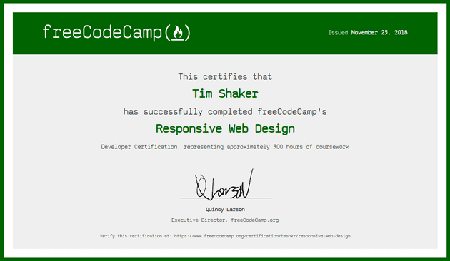
Though I’ve been practicing responsive web design for a few years, I learned a lot from freeCodeCamp’s Responsive Web Design certification program, which I have now successfully completed:
The program started off with a basic introduction to HTML, which is always good to revisit, since these are the fundamental building blocks of a website. It then transitioned into CSS and visual design, which gives a webpage its look and feel. As the popular analogy goes, if a website is a house, then HTML is the wooden frame, while CSS is the drywall and the paint. Like any good carpenter, one could spend years mastering just these two techniques to be able to create some truly amazing designs. With new HTML and CSS features continuously being implemented, there’s always something to learn, as new features gain wider browser support.
Flexbox and CSS grid are two (relatively) recent CSS features that I had shied away from before, due to the spotty browser support, but they are now widely supported by Chrome, Safari, Firefox, and Edge. With Internet Explorer being discontinued, there isn’t much of a reason to avoid using these extremely useful features that make frontend development easier, better, and more concise.
Centering content, for example, once involved all sorts of strange hacks, like negative margins and transforms
— vertical centering was frustrating if not impossible. Now all one needs to do is
merely display the parent container as a grid in order to justify and align
content to the center.
.perfect-center {
  display: grid;
  justify-content: center;
  align-content: center;
}
The projects for the Responsive Web Design certification program were where most of my learning happened, as I got to practice making layouts with CSS Grid, Flexbox, and other responsive web design techniques. The projects I made are available to view and fork on my Codepen profile:
The certification program also went into accessibility techniques, which help users with visual impairments to better access content on a website through screen readers and high-contrast text. Accessibility concerns aren’t always obvious to designers and developers who consider a website to be mainly a visual project, so it was helpful to practice with these techniques. I often find myself using the accessibility tools Read Aloud and Dark Reader because they make text easier to read, especially when reading long passages of text on a screen all day. For some reason, black text on a blinding-white screen became the norm for websites and user interfaces more broadly. Perhaps the designers of word processors and the first websites tried to emulate the experience of reading printed text on white paper — but as anyone who has spent enough time staring at a computer screen knows, this can quickly lead to eyestrain.
Technology empowers users with a potentially limitless amount of ways to do things, so there is no real reason, for example, to have a website with a light background instead of a dark one — besides the norms that have been inherited and the preferences of the users. This seemingly limitless freedom can be both a blessing and a curse: when it helps, a novel solution to a problem can enrich our lives in ways we could not imagine before, but when there is no obvious solution, the limitless possibilities presented by technology can be a barrier to moving forward, towards a goal which is not clearly defined. Experience tends to be the best guide in those kinds of situations.
